Ahead of the launch of their first U.S. restaurant in New York, Wagamama recognised that their existing UK menu needed refinement. It wasn’t just about translating dishes across markets, it was about rethinking the structure itself: simplifying the experience, removing clutter, and creating a more intuitive way for guests to navigate their choices.
Role
Lead Designer
Layout Design
Menu Design
About the project
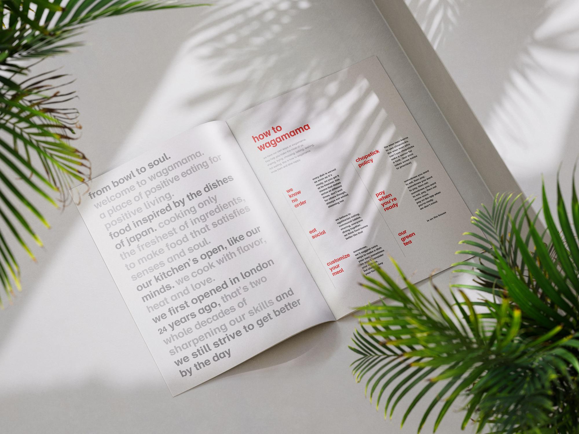
I was brought in to redesign the menu for the U.S. opening. Rather than compress information, the solution was to expand: increasing the number of pages to create breathing room and allowing the content to flow more naturally. A clear grid system was introduced to bring structure and rhythm to each spread, supported by larger category titles, a centralised price column, and a dedicated page for the brand’s manifesto, giving space for Wagamama’s philosophy to sit alongside its food.
The result was a menu that felt lighter, cleaner and easier to navigate, a design that supported Wagamama’s brand ethos while delivering a clearer, more confident experience for a new audience.