Branding, Logo Design, Art Direction
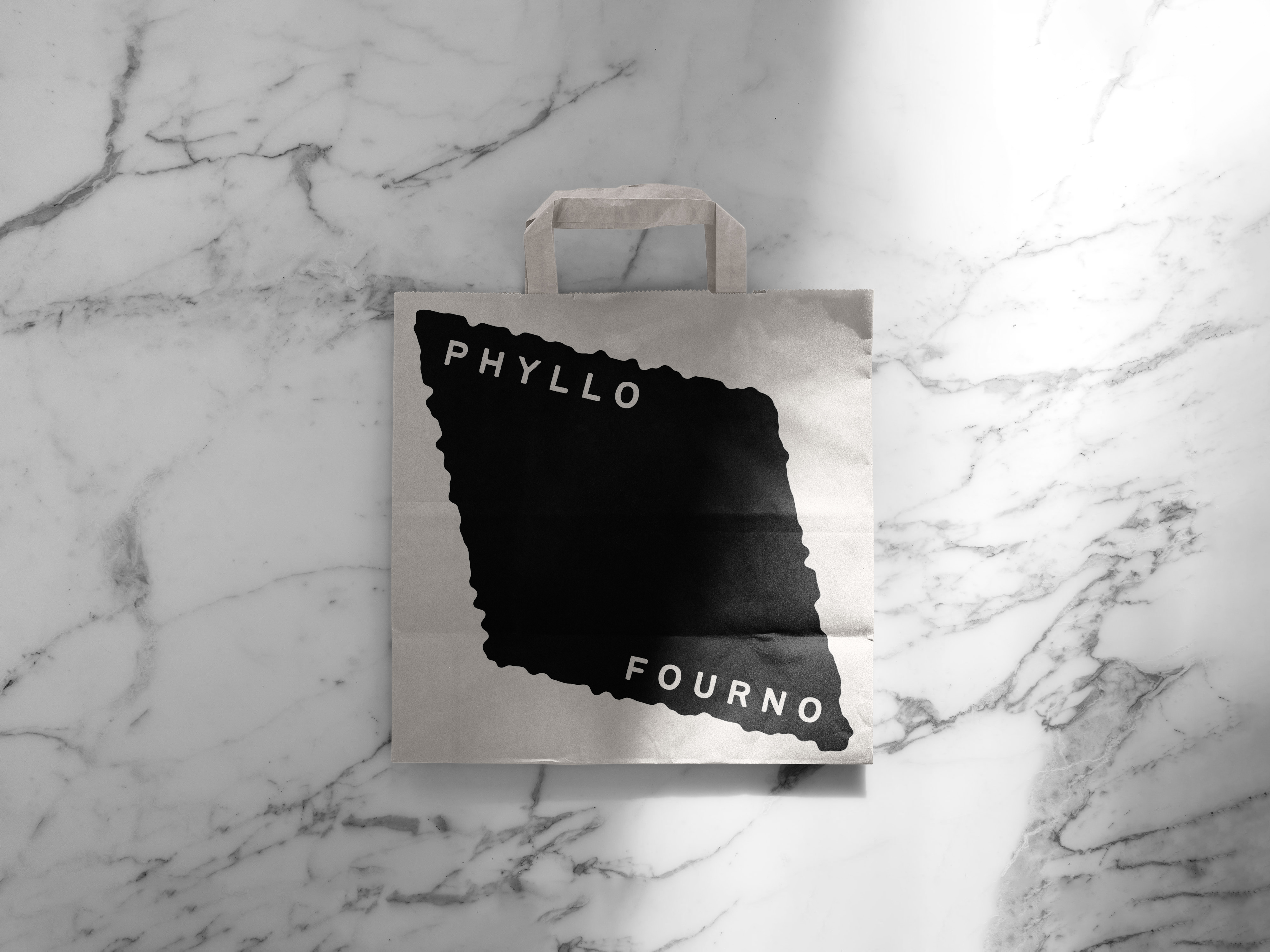
For this Greek-Cypriot bakery in London, I developed a brand identity rooted in language, material, and memory. “Phyllo” — meaning “leaf” in Greek — and “Fourno” — “in the oven” — became the foundations for a system that feels warm, tactile, and unmistakably rooted in craft.
The logo takes its form from the rounded shape of traditional clay ovens, filled with flowing lines that evoke heat waves and the rich aromas that spill from within. Around it, we built a graphic device inspired by a single sheet of filo pastry — folded, cropped, and layered to create flexible spaces for messaging and layout structure.
The design direction focused on creating a system that felt both authentic and immediate — a brand that doesn’t just represent baking, but embodies the textures, warmth, and tradition of baking done right.
Phyllo Fourno
For this Greek-Cypriot bakery in London, I developed a brand identity rooted in language, material, and memory. “Phyllo” — meaning “leaf” in Greek — and “Fourno” — “in the oven” — became the foundations for a system that feels warm, tactile, and unmistakably rooted in craft.
The logo takes its form from the rounded shape of traditional clay ovens, filled with flowing lines that evoke heat waves and the rich aromas that spill from within. Around it, we built a graphic device inspired by a single sheet of filo pastry — folded, cropped, and layered to create flexible spaces for messaging and layout structure.
The design direction focused on creating a system that felt both authentic and immediate — a brand that doesn’t just represent baking, but embodies the textures, warmth, and tradition of baking done right.


