Design Direction, Brand Identity
Nomad Foods:
While working with McCann London, I led the design development for Nomad Foods’ brand evolution — a project driven by a shared ambition to build a more progressive, future-facing identity. After years without a major refresh, they needed an identity that could match the scale of their vision — a system built not just to modernise, but to embody continuous growth.
Working in close partnership with Nomad’s leadership team, we anchored the rebrand around a single strategic idea: discovery.
At the heart of the business was a simple truth — always striving to find better ways of working, sourcing, and nourishing. Our role was to translate that spirit into a visual and verbal system that would feel dynamic, optimistic, and always in motion.
The new identity reframed Nomad Foods not as a company standing still, but as a brand built on momentum — constantly improving, adapting, and leading.
A brand that doesn’t just produce food, but shapes the future of food itself.
Nomad Foods:
Discovery
While working with McCann London, I led the design development for Nomad Foods’ brand evolution — a project driven by a shared ambition to build a more progressive, future-facing identity. After years without a major refresh, they needed an identity that could match the scale of their vision — a system built not just to modernise, but to embody continuous growth.
Working in close partnership with Nomad’s leadership team, we anchored the rebrand around a single strategic idea: discovery.
At the heart of the business was a simple truth — always striving to find better ways of working, sourcing, and nourishing. Our role was to translate that spirit into a visual and verbal system that would feel dynamic, optimistic, and always in motion.
The new identity reframed Nomad Foods not as a company standing still, but as a brand built on momentum — constantly improving, adapting, and leading.
A brand that doesn’t just produce food, but shapes the future of food itself.


Building the World of Nomad
A brand in motion needs an identity that moves with it.
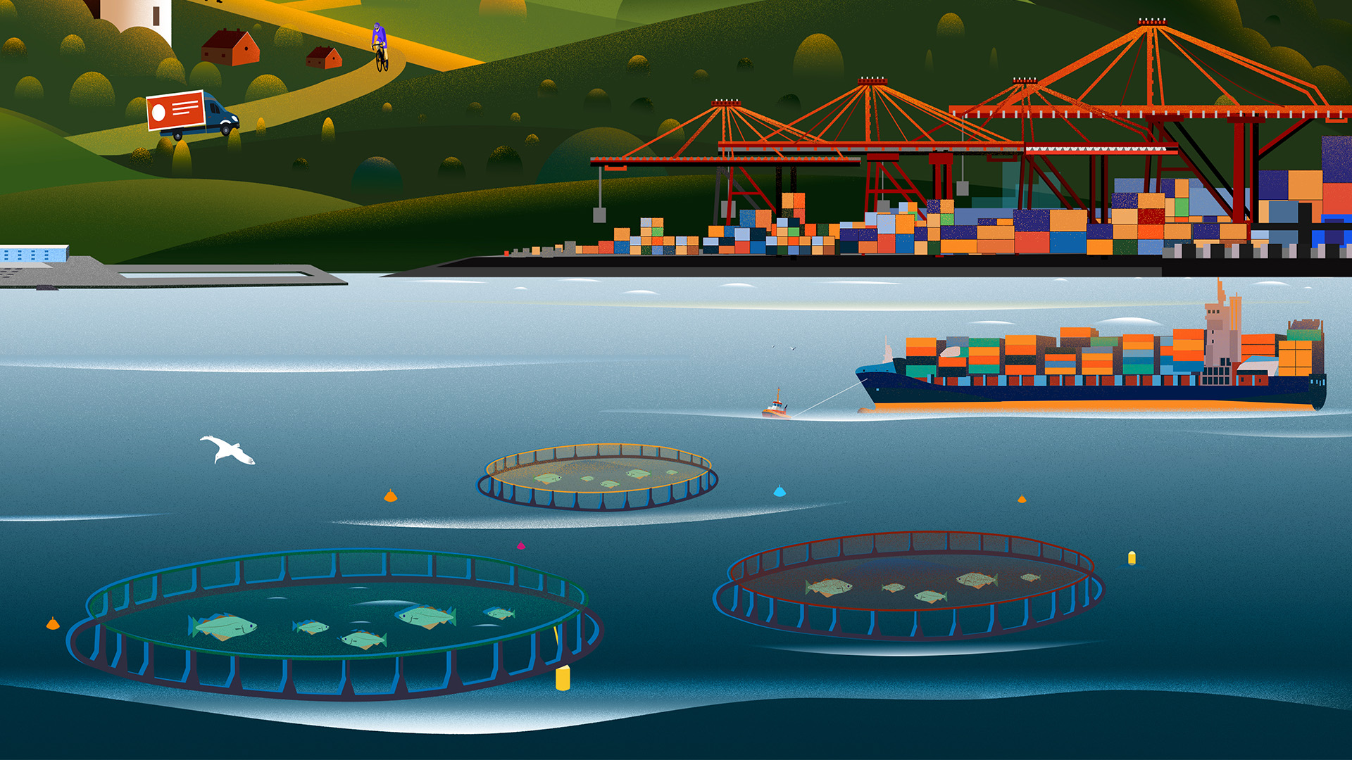
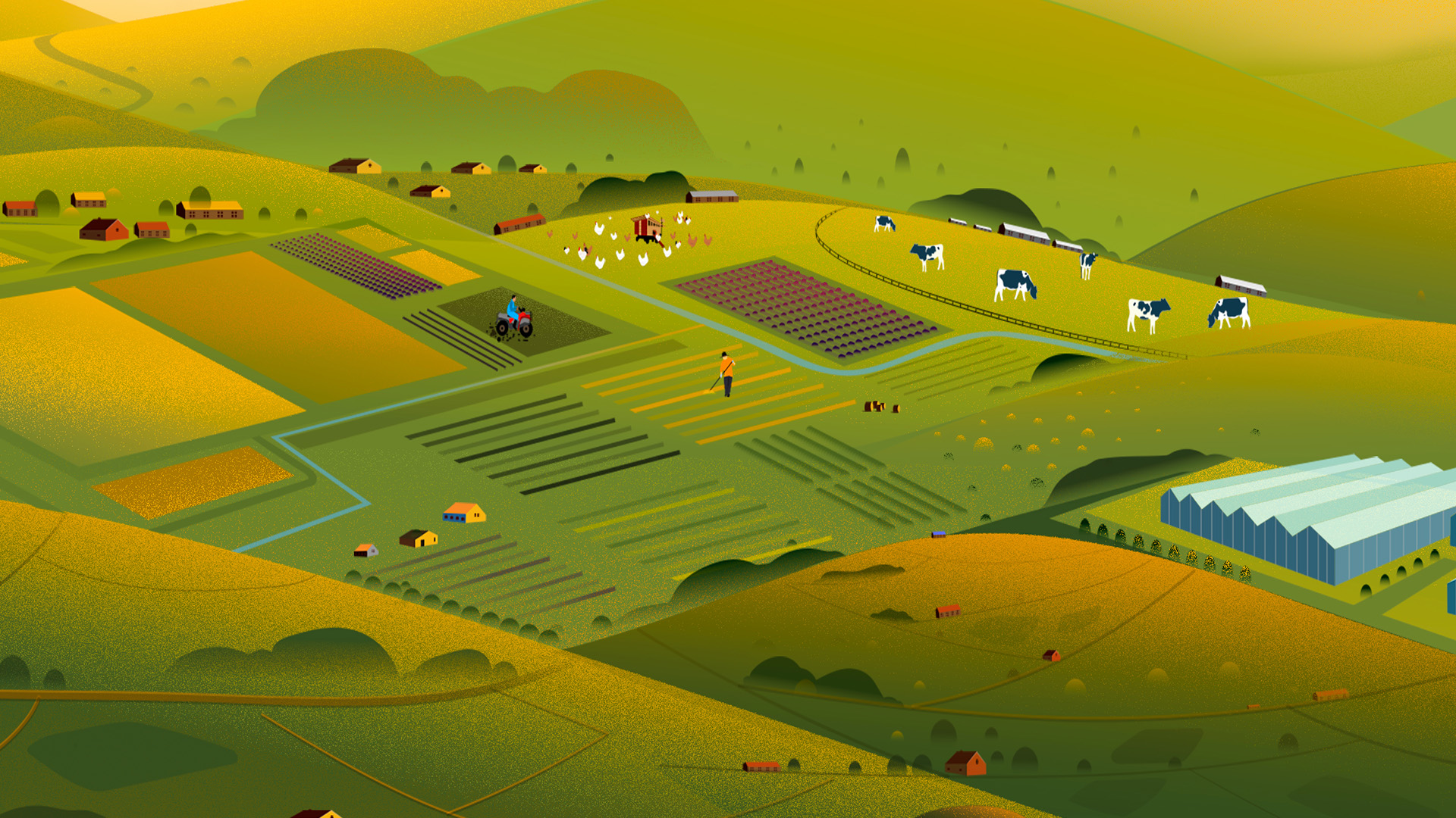
As part of Nomad Foods’ rebrand, the team needed a flexible asset — something that could adapt across campaigns, channels and audiences without losing clarity or meaning. A single, multi-dimensional illustration became the answer: a visual world expansive enough to tell multiple stories at once.
Working closely with illustrator Febin Raj, I helped shape an asset that could scale seamlessly across the brand’s communications. Every element was designed with intention: allowing Nomad to zoom into specific parts of their network — from sourcing to production to sustainability — without losing the integrity of the whole.
The result was more than an illustration. It became a visual ecosystem: a dynamic map of Nomad Foods’ mission, values and reach — adaptable, detailed, and built for discovery.


