Campaign Design
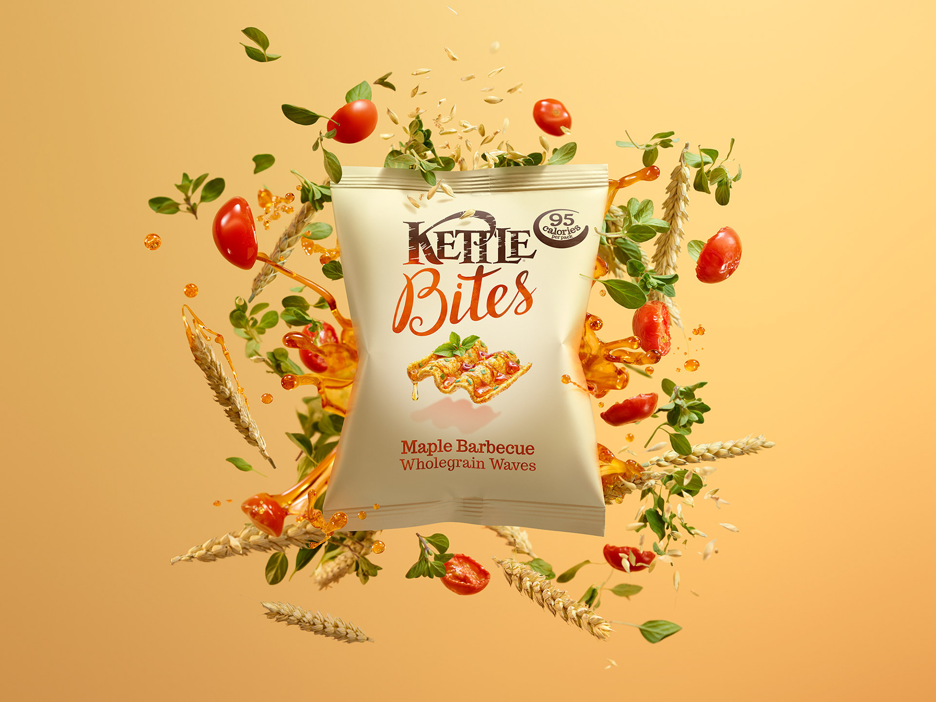
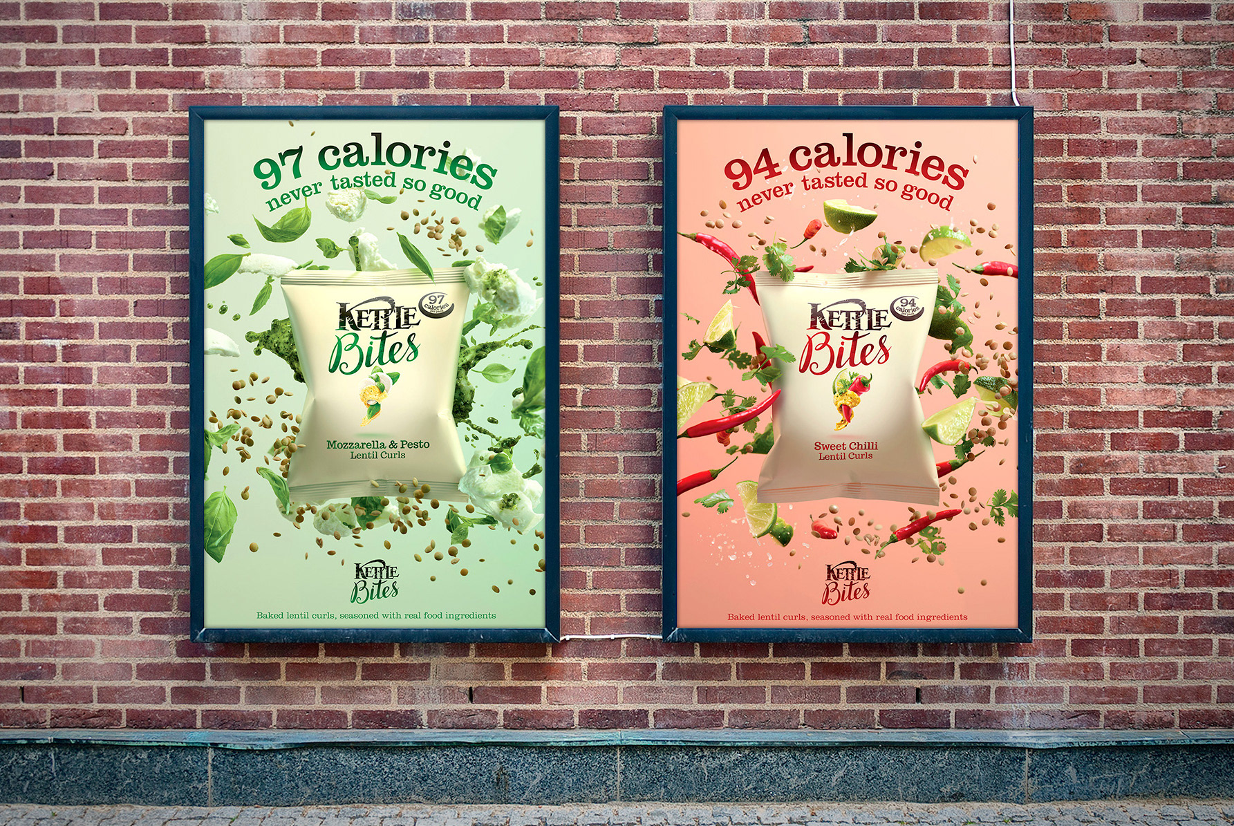
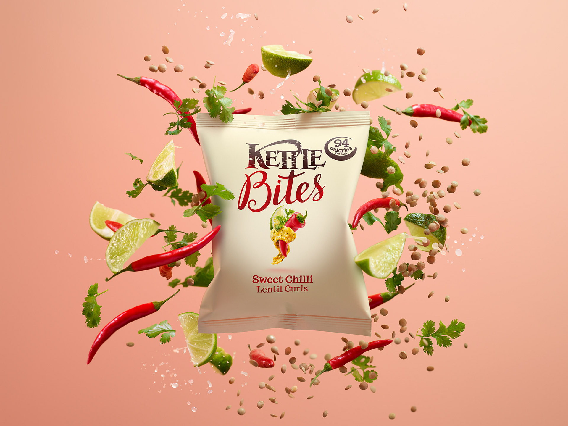
To launch Kettle’s new lower-calorie snack range, Kettle Bites, the brief was simple: make the product feel as fresh and flavourful as it tastes. Targeted at consumers focused on healthier eating, the campaign needed to cut through in print, outdoor, digital — and even on London bus wraps — with clarity and energy.
Working with 101 London, the creative direction centred around the idea of ingredients exploding from the pack — a vibrant, visual shorthand for freshness, naturalness, and bold flavour. I was brought in to refine the final artwork, applying finishing touches across the campaign: retouching photography to remove blemishes, adjusting lighting consistency, and ensuring colour balances felt bright, appetising, and true to the product’s promise.
Alongside the photography, I developed a clean typographic system and flavour-driven colour palette — keeping the layouts simple, direct and energetic, allowing the product story to stay front and centre across every format.
The result was a campaign that felt alive, appetising, and unmistakably fresh — an identity that unpacked Kettle Bites’ natural appeal at a glance.
Kettle Chips:
Kettle Bites
To launch Kettle’s new lower-calorie snack range, Kettle Bites, the brief was simple: make the product feel as fresh and flavourful as it tastes. Targeted at consumers focused on healthier eating, the campaign needed to cut through in print, outdoor, digital — and even on London bus wraps — with clarity and energy.
Working with 101 London, the creative direction centred around the idea of ingredients exploding from the pack — a vibrant, visual shorthand for freshness, naturalness, and bold flavour. I was brought in to refine the final artwork, applying finishing touches across the campaign: retouching photography to remove blemishes, adjusting lighting consistency, and ensuring colour balances felt bright, appetising, and true to the product’s promise.
Alongside the photography, I developed a clean typographic system and flavour-driven colour palette — keeping the layouts simple, direct and energetic, allowing the product story to stay front and centre across every format.
The result was a campaign that felt alive, appetising, and unmistakably fresh — an identity that unpacked Kettle Bites’ natural appeal at a glance.