Design Direction, Event Design
Cream Awards:
🏆 Creative Circle Awards 2023: Silver for Best Graphic Design
A creative transfusion.
New ideas keep industries alive. New talent is the bloodstream.
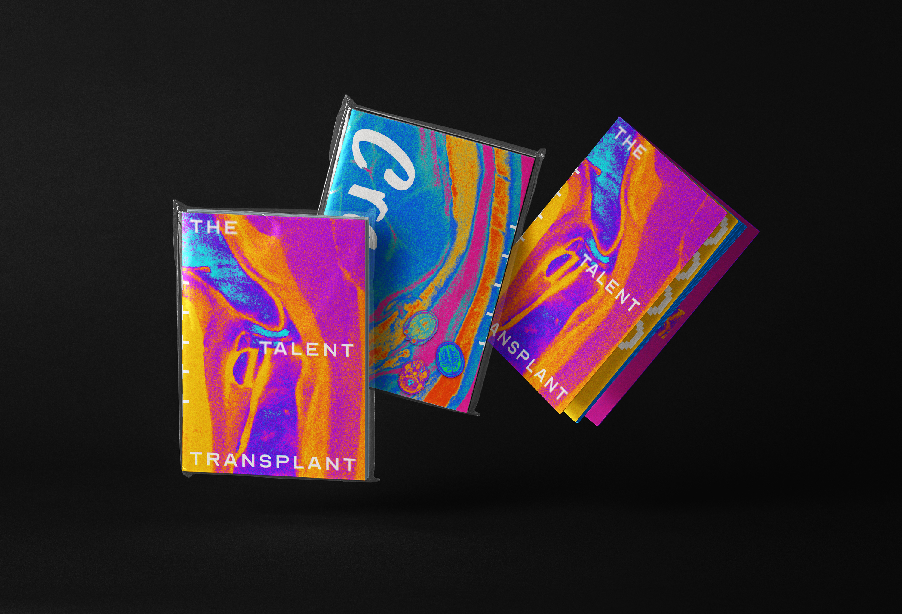
For Cream Awards, we created The Talent Transplant: a concept that reimagines emerging creativity as a vital transfer of energy — a regenerative act at the heart of the creative world.
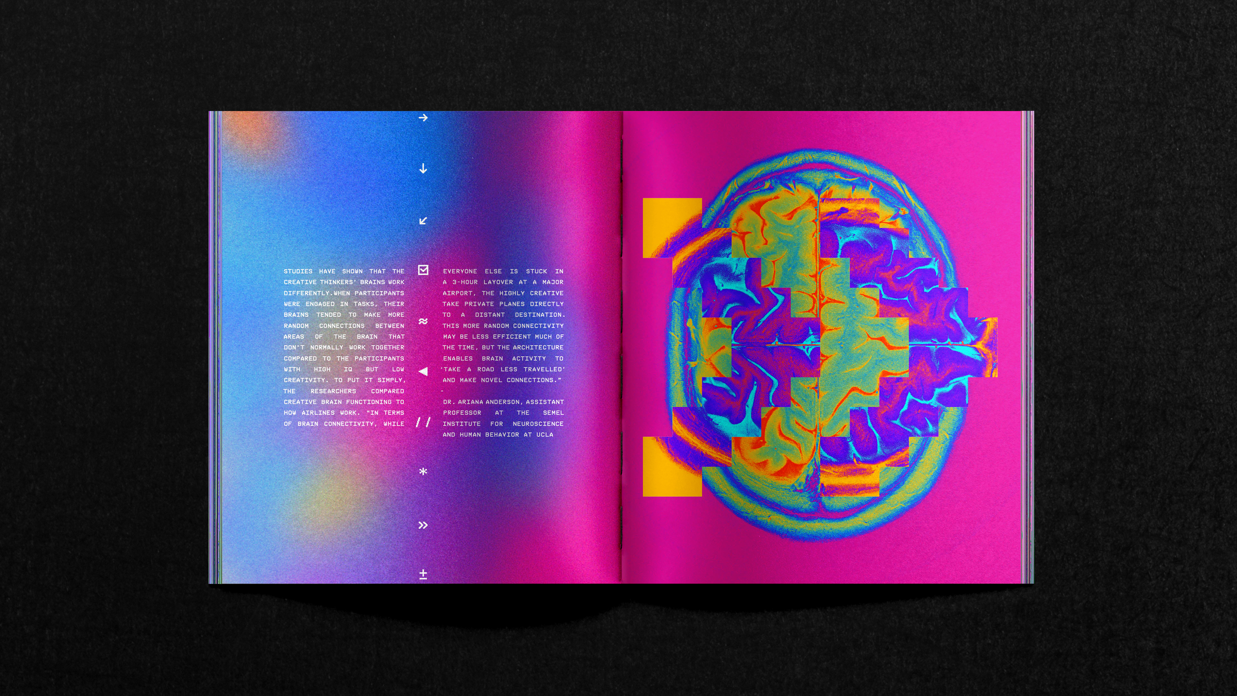
We took inspiration from the language of modern medicine. Clinical processes, diagnostic tools, imaging technologies — systems designed to observe, interpret, and nurture. Our goal was to echo that world without resorting to visual clichés, creating a brand system that felt precise, raw and human all at once.
Cream Awards:
The Talent Transplant
🏆 Creative Circle Awards 2023: Silver for Best Graphic Design
A creative transfusion.
New ideas keep industries alive. New talent is the bloodstream.
For Cream Awards, we created The Talent Transplant: a concept that reimagines emerging creativity as a vital transfer of energy — a regenerative act at the heart of the creative world.
We took inspiration from the language of modern medicine. Clinical processes, diagnostic tools, imaging technologies — systems designed to observe, interpret, and nurture. Our goal was to echo that world without resorting to visual clichés, creating a brand system that felt precise, raw and human all at once.


Design with diagnosis
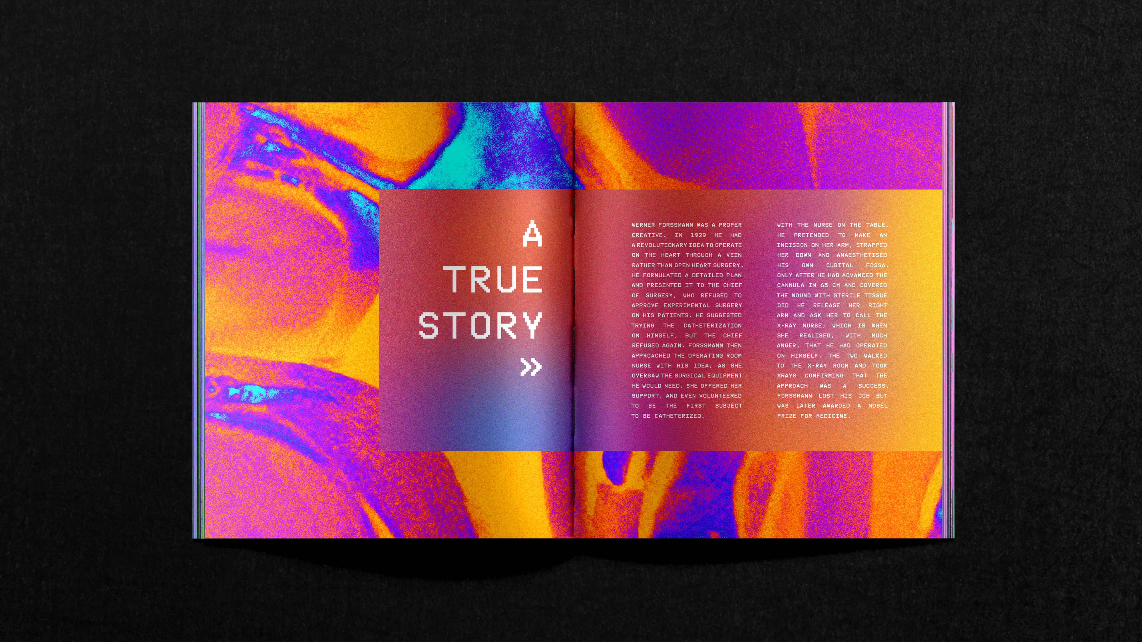
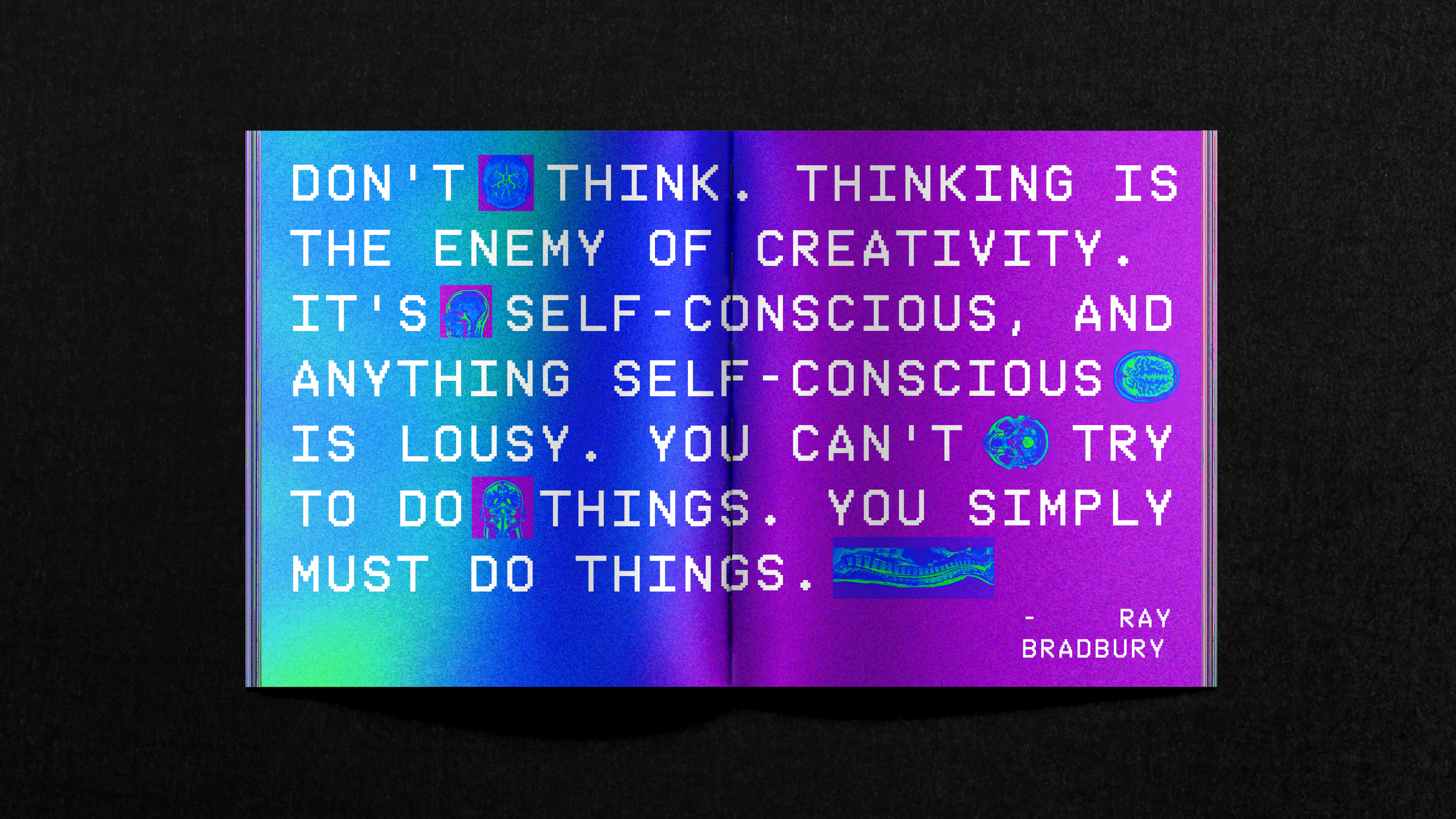
Typography drew directly from real clinical contexts: one typeface inspired by the LogMAR chart used in ophthalmology, the other echoing the pixelated readouts of diagnostic scans. Treatment was key — blurred edges, subtle pixelation and layered effects gave typography a tactile quality, like reading a diagnosis half-seen on a screen or medical chart.
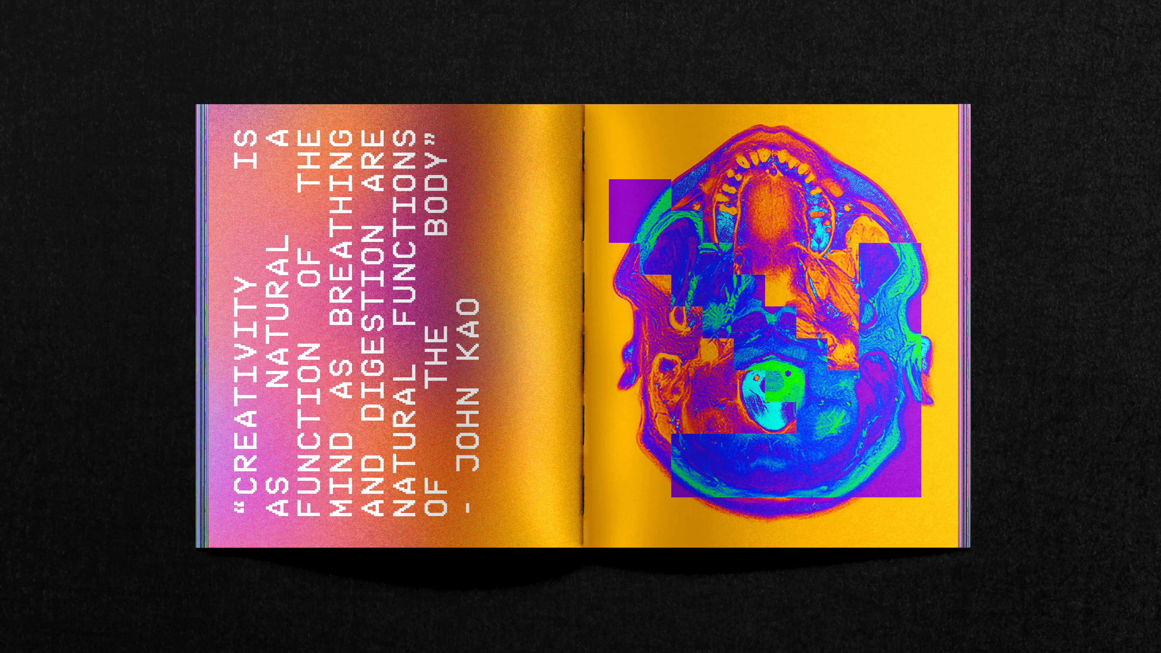
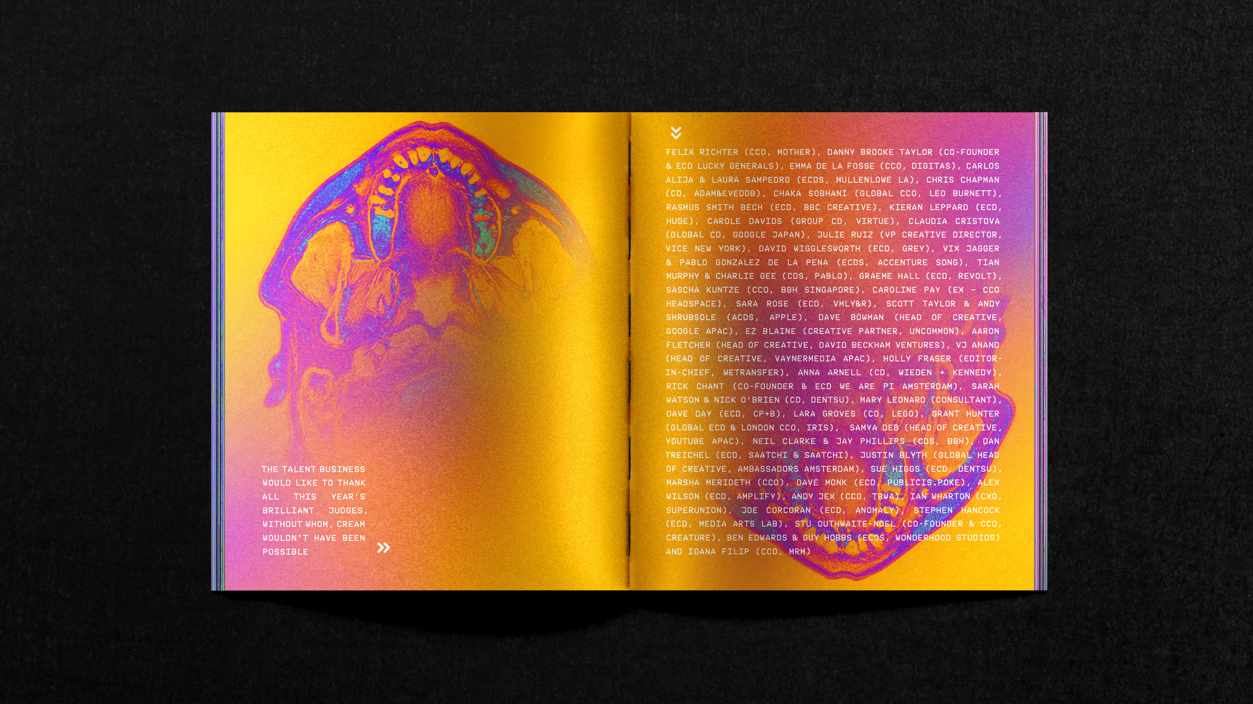
Colour choices were grounded in reality too: a palette lifted from MRI imaging, where colour helps radiologists navigate complexity.
The MRI scans themselves became a critical visual tool. The images we sourced carried the texture of imperfection — lo-fi, compressed, full of incidental beauty. Instead of correcting them, we amplified these qualities, letting them behave like suminagashi — traditional Japanese ink marbling — bringing flow, pattern and humanity into the work.


Design as intervention
With these elements, the creative system came to life. Medical symbology layered with scan textures. Portraits of students blended with organic forms. Layouts that felt assembled like case studies or patient files — a forensic but optimistic record of new talent entering the creative bloodstream.
The Talent Transplant wasn’t just a visual system. It was a way of reframing how new voices enter the industry: not as an interruption, but as an essential evolution.
A creative intervention, with design as diagnosis — and renewal as the goal.
