Campaign design, typography
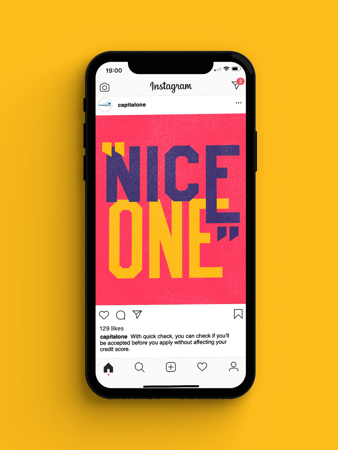
For Capital One, I created a series of typographic posters celebrating everyday moments of helpfulness — recognising the tools and services that Captial One offers, making navigating finance simpler, clearer, and more human.
The campaign centred around a distinctly British phrase — “Nice one!” — a casual, genuine way of saying thanks for being helpful, thanks for making things easier. It became a shorthand for the kind of experience Capital One aims to deliver every day.
Each poster took a different typographic approach, designed to feel like a new voice saying the same thing: bold, soft, fast, friendly — a reflection of the diversity of customers finding value in Capital One’s tools. Whether it was QuickCheck allowing users to see their eligibility before applying, or simple credit management features, each design framed small acts of clarity as reasons to celebrate.
I helped guide the visual system across the series, ensuring that while each piece had its own character, the overall feel stayed cohesive: spirited, optimistic, and unmistakably human.
Nice one wasn’t just a compliment — it became a way of showing that good service, when delivered right, leaves a lasting impression.
Capital One: Nice One
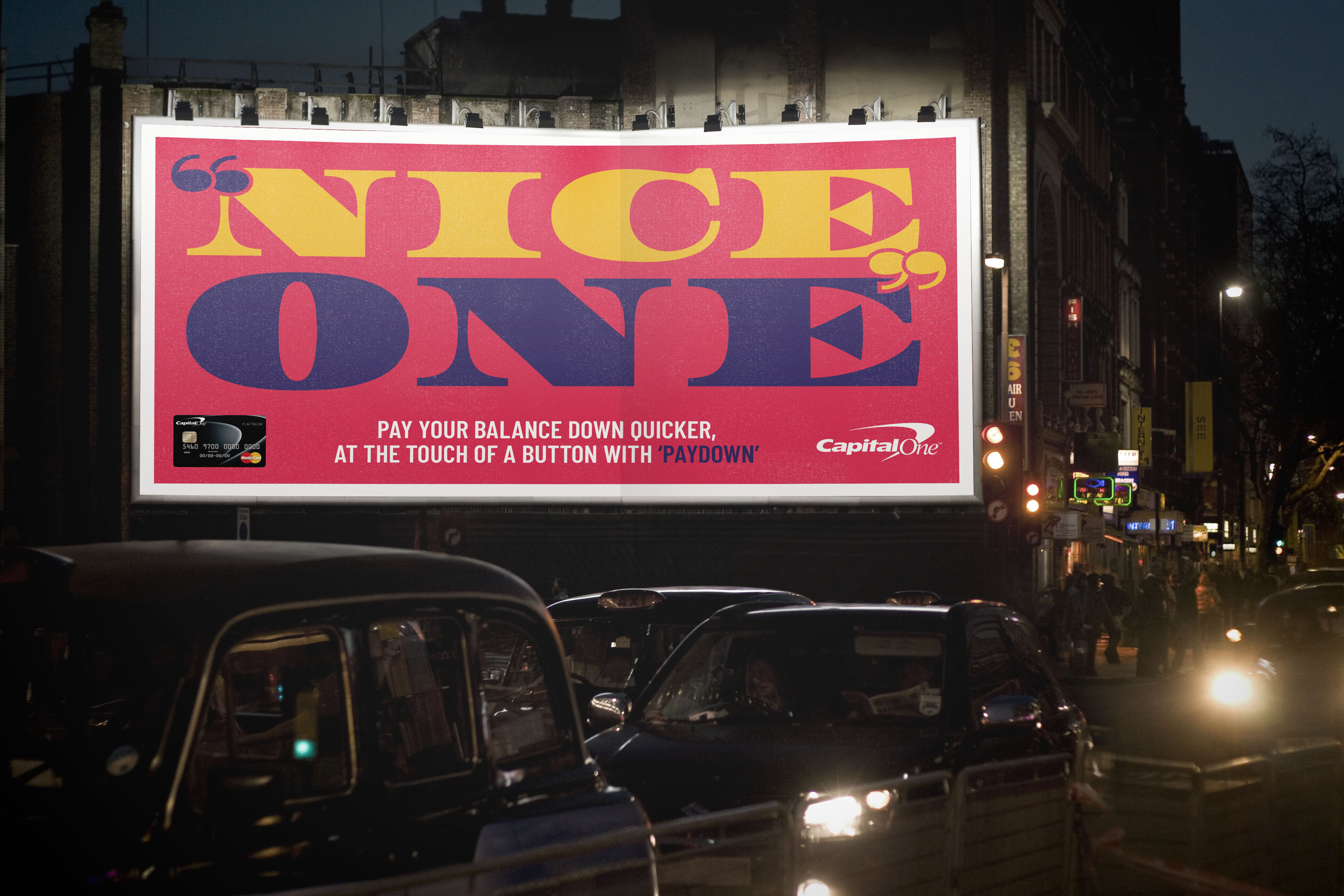
For Capital One, I created a series of typographic posters celebrating everyday moments of helpfulness — recognising the tools and services that Captial One offers, making navigating finance simpler, clearer, and more human.
The campaign centred around a distinctly British phrase — “Nice one!” — a casual, genuine way of saying thanks for being helpful, thanks for making things easier. It became a shorthand for the kind of experience Capital One aims to deliver every day.
Each poster took a different typographic approach, designed to feel like a new voice saying the same thing: bold, soft, fast, friendly — a reflection of the diversity of customers finding value in Capital One’s tools. Whether it was QuickCheck allowing users to see their eligibility before applying, or simple credit management features, each design framed small acts of clarity as reasons to celebrate.
I helped guide the visual system across the series, ensuring that while each piece had its own character, the overall feel stayed cohesive: spirited, optimistic, and unmistakably human.
Nice one wasn’t just a compliment — it became a way of showing that good service, when delivered right, leaves a lasting impression.